12. 요소 배치 ( position )
1) display 속성
가. 개념
요소를 어떻게 배치할지를 제어가 가능한 속성.
블럭레벨로 배치/인라인 레벨로 배치/랜더링 방지/인라인처럼 배치되지만 width 와 height 지정가능
display: block;
display: inline;
display: none; // 영역유지 안됨.
display: inline-block;
<!DOCTYPE html>
<html lang="en">

<head>
    <title>요소배치1 - display1-기본</title>
    <meta charset="UTF-8">
    <meta name="viewport" content="width=device-width, initial-scale=1.0">
    <style>
        div {
            /* 블럭레벨 -> 인라인레벨 */
            display: inline;
        }

        span {
            /* 인라인레벨 -> 블럭레벨 */
            display: block;
        }

        p {
            /*  p -> 랜더링x */
            display: none;
        }
    </style>
</head>

<body>
    <!-- 블럭레벨 -->
    <div>Hello1</div>
    <div>Hello2</div>
    <div>Hello3</div>
    <hr>
    <p>홍길동</p>
    <hr>
    <!-- 인라인레벨 -->
    <span>world1</span>
    <span>world2</span>
    <span>world3</span>
    <hr>
</body>

</html>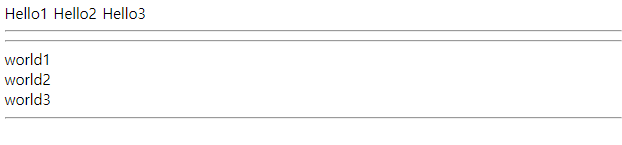
<!DOCTYPE html>
<html lang="en">

<head>
    <title>요소배치1 - display2_inline-block</title>
    <meta charset="UTF-8">
    <meta name="viewport" content="width=device-width, initial-scale=1.0">
    <style>
        /*
        span 은 영역확장이 안되는데 display: inline-block 으로 하게되면
        영역확장이 가능하다.
        */
        span {
            background-color: yellow;
            width: 100px;
            height: 100px;
            display: inline-block;
        }
    </style>
</head>

<body>
    안녕하세요<span>홍길동님</span>, 감사합니다.
</body>

</html>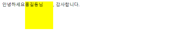
2) position 속성
가. 개요
- display 속성은 요소가 배치되는 기본적인 규칙만 변경할 수 있다. ( 블럭레벨, 인라인레벨 )
- top, left, right, bottom 속성을 이용해서 요소의 실제위치를 바꿀수 있다.
나. 용어
배치 컨텍스트( positioning context ): 누구를 기준으로 삼을건지를 결정하는 용어.
문서 대열 ( document flow ): 웹브라우저에 요소가 기본적으로 배치되는 용어.
다. 종류
- position: static
==> 기본.
기본적인 문서 대열 ( document flow, normal flow ) 를 따른다.
따라서 임의적으로 위치변경이 불가능하다.
즉, top,left,right,bottom 속성이 적용이 안됨.
역으로, top,left,right,bottom 속성이 적용될려면 static 이 아닌 다른값으로 지정해야 된다.
<!DOCTYPE html>
<html lang="en">

<head>
    <title>요소배치2 - position1_static</title>
    <meta charset="UTF-8">
    <meta name="viewport" content="width=device-width, initial-scale=1.0">
    <style>
        div.static {
            border: 2px solid red;

            /* static 은 아무리 위치변경을 해도 변경이 안됨. */
            position: static;
            top: 100px;
            left: 500px;
        }
    </style>
</head>

<body>
    <h2>static 실습</h2>
    <p>
        기본.
        기본적인 문서 대열 ( document flow, normal flow )를 따른다.
        따라서 임의적으로 위치변경이 불가능하다.
        즉, top,left,right,bottom 속성이 적용이 안됨.
        역으로, top,left,right,bottom 속성이 적용될려면 static 이 아닌 다른값으로 지정해야 된다.
    </p>
    <div class="static">
        기본적인 문서 대열 ( document flow, normal flow )를 따른다.
    </div>
</body>

</html>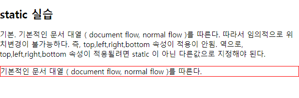
- position: relative
==> 배치 컨텍스트(기준)는 기본적인 문서 대열( document flow, normal flow ) 이다.
top,left,right,bottom 속성이 적용이 된다.
<!DOCTYPE html>
<html lang="en">

<head>
    <title>요소배치2 - position2_relative</title>
    <meta charset="UTF-8">
    <meta name="viewport" content="width=device-width, initial-scale=1.0">
    <style>
        div.relative {
            border: 2px solid red;

            position: relative;
            top: 100px;
            left: 200px;
        }
    </style>
</head>

<body>
    <h2>relative 실습</h2>
    <p>
        배치 컨텍스트(기준)는 기본적인 문서 대열( document flow, normal flow ) 이다.
        top,left,right,bottom 속성이 적용이 된다.
    </p>
    <div class="relative">
        기본적인 문서 대열 ( document flow, normal flow )를 기준으로
        위치가 결정됨.
    </div>
</body>

</html>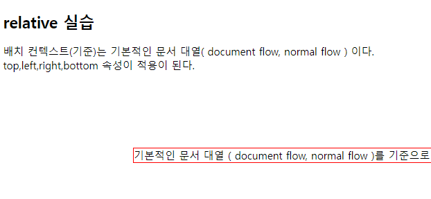
- position: absolute
==> 배치 컨텍스트(기준)는 가장 가까운 부모(조상) 이다.
==> 2가지 상황이 있음.
가. 부모(조상)에 position 없는 경우
ex)
- id="b" 의 부모는 a 가 position 이 지정이 안되어있거나 static 인 경우
body 가 부모가 된다.
- html(body) 기준
- top, left, right, bottom 속성이 적용이 됨.
나. 부모(조상)에 position: relative 있는 경우
ex)
-
- top, left, right, bottom 속성이 적용이 됨.
<!DOCTYPE html>
<html lang="en">
<head>
<title>요소배치2 - position3_absolute</title>
<meta charset="UTF-8">
<meta name="viewport" content="width=device-width, initial-scale=1.0">
<style>
html {
border: 10px solid blue;
}
div.relative {
width: 400px;
height: 200px;
border: 3px solid skyblue;
position: relative;
}
div.absolute {
/*
원래 부모의 position 이 없거나 static 인 경우
body 태그를 부모로 인식하여 위치를 조정한다.
*/
/*
부모의 position 이 없거나 static 이 아닌경우
부모의 범위안에서만 위치를 조정한다.
*/
width: 200px;
height: 100px;
border: 3px solid red;
position: absolute;
top: 100px;
right: 0px;
}
</style>
</head>
<body>
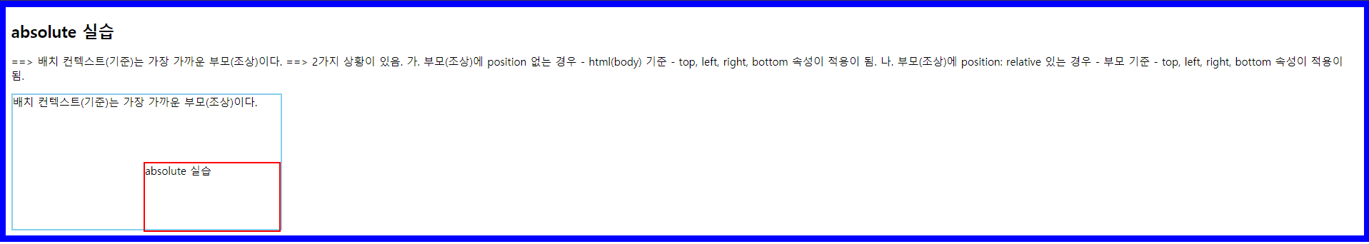
<h2>absolute 실습</h2>
<p>
==> 배치 컨텍스트(기준)는 가장 가까운 부모(조상)이다.
==> 2가지 상황이 있음.
가. 부모(조상)에 position 없는 경우
- html(body) 기준
- top, left, right, bottom 속성이 적용이 됨.
나. 부모(조상)에 position: relative 있는 경우
- 부모 기준
- top, left, right, bottom 속성이 적용이 됨.
</p>
<div class="relative">
배치 컨텍스트(기준)는 가장 가까운 부모(조상)이다.
<div class="absolute">
absolute 실습
</div>
</div>
</body>
</html>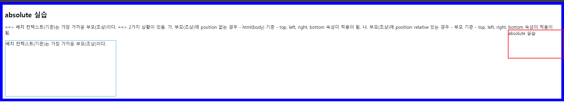
- position: fixed
==> 배치 컨텍스트(기준)는 뷰포트( view port ) 이다.
top, left, right, bottom 속성이 적용이 됨.
스크롤해도 고정되어 있음.
<!DOCTYPE html>
<html lang="en">

<head>
    <title>요소배치2 - position4_fixed</title>
    <meta charset="UTF-8">
    <meta name="viewport" content="width=device-width, initial-scale=1.0">
    <style>
        /* 화면을 늘리거나 줄여도 고정된 위치에 있음. */
        div.fixed {
            border: 3px solid red;

            position: fixed;
            right: 0px;
            bottom: 0px;
        }
    </style>
</head>

<body>
    <h2>fixed 실습</h2>
    <p>
        배치 컨텍스트(기준)는 뷰포트( view port ) 이다.
        top, left, right, bottom 속성이 적용이 됨.
        스크롤해도 고정되어 있음.<br>
        배치 컨텍스트(기준)는 뷰포트( view port ) 이다.
        top, left, right, bottom 속성이 적용이 됨.
        스크롤해도 고정되어 있음.<br>
        배치 컨텍스트(기준)는 뷰포트( view port ) 이다.
        top, left, right, bottom 속성이 적용이 됨.
        스크롤해도 고정되어 있음.<br>
		.......
    </p>
    <div class="fixed">
        fixed 실습
    </div>
</body>

</html>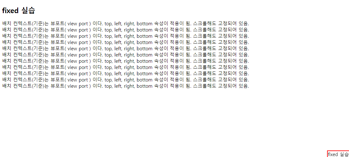
* 정리
static 와 relative 는 문서 대열 ( document flow, normal flow ) 에서 제외가 안됨.
absolute 와 fixed 는 문서 대열 ( document flow, normal flow ) 에서 제외됨.
따라서 요소들이 겹쳐서 랜더링 될 수 있다.
- position: sticky
==> 최근에 추가된 기능임. 따라서 caniuse.com 에서 지원여부 확인 할 것.
static 과 fixed 합쳐진 기능.
평상시에는 특정한 임계점에 오면 fixed 처럼 동작됨.
ex)
position: sticky;
top: 30px;
<!DOCTYPE html>
<html lang="en">

<head>
    <title>요소배치2 - position5_sticky</title>
    <meta charset="UTF-8">
    <meta name="viewport" content="width=device-width, initial-scale=1.0">
    <style>
        div.sticky {
            border: 3px solid red;
            position: sticky;
            /* 평상시에는 static 처럼 동작하고 top:40px 이 되면 fixed 로 동작됨 */
            top: 40px;
        }
    </style>
</head>

<body>
    <h2>sticky 실습</h2>
    <div class="sticky">
        sticky 실습
    </div>
    <p>
        최근에 추가된 기능임. 따라서 caniuse.com 에서 지원여부 확인 할 것.
        static 과 fixed 합쳐진 기능.
        평상시에는 특정한 임계점에 오면 fixed 처럼 동작됨.<br>
        최근에 추가된 기능임. 따라서 caniuse.com 에서 지원여부 확인 할 것.
        static 과 fixed 합쳐진 기능.
        평상시에는 특정한 임계점에 오면 fixed 처럼 동작됨.<br>
        최근에 추가된 기능임. 따라서 caniuse.com 에서 지원여부 확인 할 것.
        static 과 fixed 합쳐진 기능.
        평상시에는 특정한 임계점에 오면 fixed 처럼 동작됨.<br>
		.....
    </p>
</body>

</html>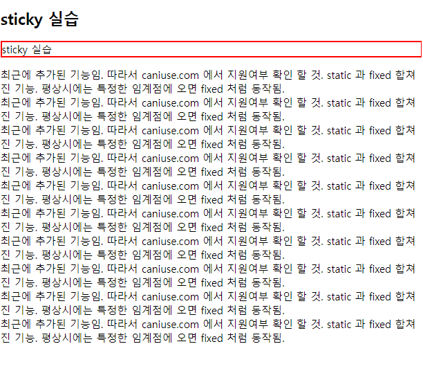

3) z-index 속성
가. 개념
absolute 와 fixed 문서 대열 ( document flow, normal flow ) 에서 제외됨.
따라서 요소들이 겹쳐서 랜더링 될 수 있다.
stack 에 요소들을 쌓게 된다.
나. 요소 배치하는 방식 3가지
x축으로 배치: 왼쪽에서 오른쪽 배치 ( 인라인 )
y축으로 배치: 위에서 아래 배치 ( 블럭 )
z축으로 배치: 깊이
다. 특징
- z-index: auto; 기본값임 ( z-index: 0 과 동일 )
- 값이 작을 수록 stack 밑에 배치된다.
(양수)
0 (기본)
(음수)
- 반드시 position 이 지정되어야 한다. ( static 제외 )
<!DOCTYPE html>
<html lang="en">

<head>
    <title>요소배치3 - z-index</title>
    <meta charset="UTF-8">
    <meta name="viewport" content="width=device-width, initial-scale=1.0">
    <style>
        img {
            position: absolute;
            top: 0px;
            left: 0px;
            z-index: -1;
        }
    </style>
</head>

<body>
    <h2>z-index 실습</h2>
    <img src="images/001.png" width="100px" height="100px" alt="이미지">
    <p>
        absolute 와 fixed 문서 대열 ( document flow, normal flow ) 에서 제외됨.
        따라서 요소들이 겹쳐서 랜더링 될 수 있다.
        stack 에 요소들을 쌓게 된다.
    </p>
</body>

</html>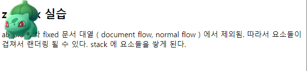

'[study]이론정리 > HTML & CSS & JavaScript' 카테고리의 다른 글
| CSS 3일차 - 크기단위 ( units ) (0) | 2024.04.24 |
|---|---|
| CSS 3일차 - background (0) | 2024.04.24 |
| CSS 3일차 - 2일차 정리 및 수정 (0) | 2024.04.24 |
| CSS 2일차 - Box Model, box-sizing, margin, padding, border (1) | 2024.04.23 |
| CSS 2일차 - 선택자(2), BEM, 의사클래스, 의사요소 (0) | 2024.04.23 |


