14. 크기 단위 ( units )
1) 단위 종류
- px
- %
- rem, em
- vw, vh ( viewport width, viewport height )
2) 사용가능한 속성
- width/ height
- font-size
- margin / padding / border
- top / right / bottom / left
3) 크기종류
가. 절대 길이(크기)
- px 만 사용하자.
나. 상대 길이(크기)
a. viewport(뷰포트) 기준
- vw, vh ( viewport width, viewport height )
- 뷰포트(viewport) 기준으로 너비 설정 방법 2가지
첫째:
position:fixed + width | height 로도 뷰포트 기준으로 길이(크기)설정 가능
.x {
position: fixed;
width: 50%;
height: 50%;
}
둘째:
.x {
position: fixed | relative | absolute 지정과 무관하게 동작됨.
width: 50vw;
height: 50vh;
}
<!DOCTYPE html>
<html lang="en">

<head>
    <title>크기단위1- position값에 따른 퍼센트</title>
    <style>
        #a {
            background-color: red;
            width: 500px;
            height: 500px;
        }

        .x {
            background-color: blue;
            /* position: fixed + % 사용하면 viewport 기준으로 width|height 설정 가능 */
            position: fixed;
            width: 50%;
        }

        .x2 {
            background-color: yellow;
            /*  position: relative; 는 가장 가까운 블럭레벨의 부모(조상) 기준 */
            position: relative;
            width: 50%;
        }

        /* --------------------------------------------------- */

        #b {
            background-color: aqua;
            width: 400px;
            height: 400px;
            position: relative;
        }

        .x3 {
            background-color: yellow;
            position: absolute;
            width: 50%;
        }
    </style>
</head>

<body>
    <div id="a">
        <h1 class="x">Hello1(뷰포트기준)</h1>
        <!-- x2 경우 부모가 span 이면 적용 x -->
        <h1 class="x2">Hello2(가까운부모기준, 반드시 부모는 블럭라벨)</h1>
    </div>

    <div id="b">
        <h1 class="x3">Hello3(absolute, relate 로 지정된 부모기준)</h1>
    </div>
</body>

</html>
<!DOCTYPE html>
<html lang="en">

<head>
    <title>크기단위2- viewport 기준의 width 와 height 인 vw, vh</title>
    <style>
        #a {
            background-color: red;
            width: 500px;
            height: 500px;
        }

        /* x 와 x2 는 같은 역할을 한다. */

        .x2 {
            background-color: blue;
            /* position: fixed + % 사용하면 viewport 기준으로 width|height 설정 가능 */
            position: fixed;
            width: 50%;
        }

        .x {
            /* * vw 와 vh 는 지정된 position 과 무관  */
            /* position: relative; */
            background-color: blue;
            /* 50vw = 50 viewport width */
            width: 50vw;
        }
    </style>
</head>

<body>
    <div id="a">
        <h1 class="x">Hello1</h1>
    </div>
</body>

</html>
b. 글꼴 길이에 사용할 때 웹브라우저의 기본글꼴크기(기본: 16px) 가 기준
- rem, em
ex) 1rem=16px
* 무조건 16px이 1rem 이 아니고 만약 웹브라우저에서 글꼴크기를 20px로 변경하게되면
1rem 은 20px 이 된다.
c. %
c-1) 기본은 부모요소 기준이다.
예>
<div> <== width:100px
<div> <== width:50% ( 부모인 width:100px의 50% 확보. 실제값은 50px이 됨 )
c-2) position:fixed + %
예>
<div> <== width:100px
<div> <== position:fixed; width:50% ( 뷰포트의 50% 확보.)
- 화면크기를 변경하면 자동으로 설정된 크기도 변경된다.
c-2) position:relative + %
예>
<div> <== width:100px
<div> <== position:relative; width:50% ( 부모인 width:100px의 50% 확보. 실제값은 50px이 됨 )
- 만약에 부모가 인라인 레벨이면 적용안됨
c-3) position:absolute + %
예>
<div> <== position:relative;width:100px
<div> <== position:absolute; width:50% ( 부모인 width:100px의 50% 확보. 실제값은 50px이 됨 )
- 부모를 position:relative 지정하고 사용해야됨.
지정하면 자식은 부모의 width를 참조하여 %가 적용됨.
4) max-width 속성
- % 사용시 화면크기가 커지면 비율로 설정했기 때문에
이미지가 계속 커질 수 있음.
그런데 이미지의 부모(컨테이너) 크기를 제한하면 더 이상 커지지 않을 수 있다.
이때 부모(컨테이너)에 max-width: 500px 지정하여
지정된 500px 보다 더 커지지 않도록 제어가 가능하다.
<!DOCTYPE html>
<html lang="en">

<head>
    <title>크기단위3 - max-width 속성</title>
    <style>
        #a {
            max-width: 500px;
        }

        .x {
            width: 100%;
        }
    </style>
</head>

<body>
    <div id="a">
        <img src="images/001.png" class="x">
    </div>
</body>

</html>
5) rem, em
- 글꼴 크기지정시 사용
- 기준은 웹브라우저에서 설정된 기본글꼴크기이다. ( 기본값은 16px )
가. em
- 부모 요소의 em값을 상속해서 글꼴크기가 정해진다.
ex)
<div> <-- 1.2 em ( 16 * 1.2 = 19.2px )
<div> <-- 1.3 em ( 16 * 1.2 * 1.3 = 24.96px )
<div> <-- ?
나. rem ( 권장 )
- root 인 html 기준으로 글꼴크기가 정해짐.
ex)
<div> <-- 1.2 em ( 16 * 1.2 = 19.2px )
<div> <-- 1.3 em ( 16 * 1.3 = 20.8px )
<div> <-- ?
<!DOCTYPE html>
<html lang="en">

<head>
    <title>크기단위4_rem-em</title>
    <style>
        #a li {
            font-size: 1.2em;
        }

        #b li {
            font-size: 1.2rem;
        }

        /* --------------------- */

        #x {
            font-size: 1rem;
        }
    </style>
</head>

<body>
    <p>Hello</p>
    <p id="x">Hello2</p>
    <ul id="a">
        <li>AAAA(16*1.2=19.2px)</li>
        <li>AAAA2</li>
        <li>
            <ul>
                <li>BBBB(16*1.2*1.2=23.04px)</li>
                <li>BBBB2</li>
            </ul>
        </li>
    </ul>

    <ul id="b">
        <li>AAAA(16*1.2)</li>
        <li>AAAA2</li>
        <li>
            <ul>
                <li>BBBB(16*1.2)</li>
                <li>BBBB2</li>
            </ul>
        </li>
    </ul>
</body>

</html>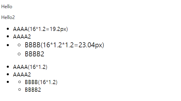
'[study]이론정리 > HTML & CSS & JavaScript' 카테고리의 다른 글
| CSS 4일차 - 색상, visibility, opacity, font, google font, text (0) | 2024.04.25 |
|---|---|
| CSS 4일차 - 3일차 정리 (0) | 2024.04.25 |
| CSS 3일차 - background (0) | 2024.04.24 |
| CSS 3일차 - 요소배치(position) (0) | 2024.04.24 |
| CSS 3일차 - 2일차 정리 및 수정 (0) | 2024.04.24 |


