13. 배경( background ) 관련
1) 배경 이미지
- background-image 속성이용
- 문법:
background-image: url( " images/ " );
background-image: url( " images/a " ), url( " images/b " );
// a 가 가장위에 보임.
- 특징은 기본적으로 이미지가 반복되고 텍스트의 배경으로 랜더링 된다.
2) 배경색
- background-color 속성
- 문법:
background-color: 색상;
* 정리
background-image 와 background-color 같이 사용하면 background-image 가 보인다.
<!DOCTYPE html>
<html lang="en">

<head>
    <title>background01_image</title>
    <meta charset="UTF-8">
    <meta name="viewport" content="width=device-width, initial-scale=1.0">
    <style>
        div {
            height: 900px;
            /* image + color */
            background-image: url("images/plans-background.jpg");
            background-color: antiquewhite;
        }
    </style>
</head>

<body>
    <h1>background-image</h1>
    <div>
        배치 컨텍스트(기준)는 뷰포트( view port ) 이다.
        top, left, right, bottom 속성이 적용이 됨.
        스크롤해도 고정되어 있음.<br>
        배치 컨텍스트(기준)는 뷰포트( view port ) 이다.
        top, left, right, bottom 속성이 적용이 됨.
        스크롤해도 고정되어 있음.<br>
		......
    </div>
</body>

</html>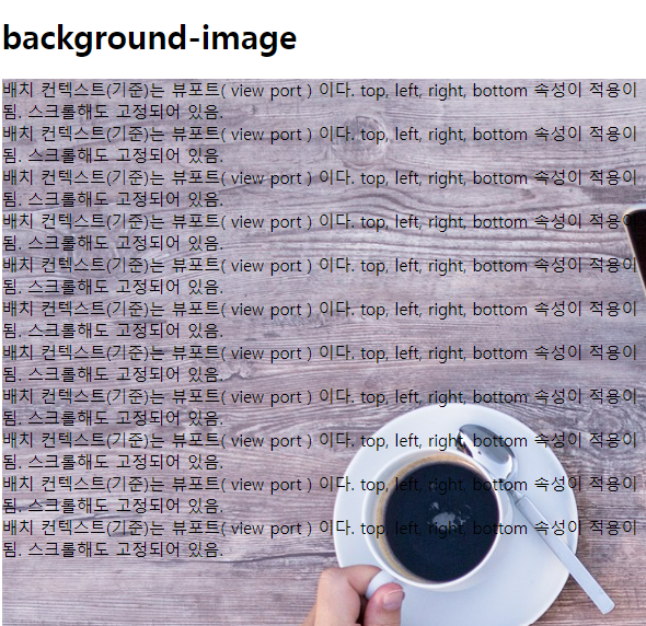
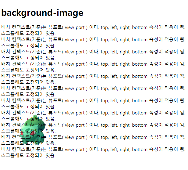
3) 배경 이미지 반복 제어
- background-repeat 속성
- 문법:
background-repeat: repeat-x | repeat-y | repeat | no-repeat
<!DOCTYPE html>
<html lang="en">

<head>
    <title>background02_repeat</title>
    <meta charset="UTF-8">
    <meta name="viewport" content="width=device-width, initial-scale=1.0">
    <style>
        div {
            height: 900px;
            background-image: url("images/001.png");
            /* repeat (반복) */
            /* background-repeat: repeat-x | repeat-y | repeat | no-repeat */
            background-repeat: no-repeat;
        }
    </style>
</head>

<body>
    <h1>background-image</h1>
    <div>
        배치 컨텍스트(기준)는 뷰포트( view port ) 이다.
        top, left, right, bottom 속성이 적용이 됨.
        스크롤해도 고정되어 있음.<br>
        배치 컨텍스트(기준)는 뷰포트( view port ) 이다.
        top, left, right, bottom 속성이 적용이 됨.
        스크롤해도 고정되어 있음.<br>
		.....
    </div>
</body>

</html>
4) 배경 사이즈
- background-size 속성
- 문법:
background-size: auto | px | contain | cover;
auto : 기본값. 크기를 자동으로 설정함.
px : 절대값
ex)
background-size: 10px 20px // width: 10px height: 20px
contain: 이미지를 보여주는 컨테이너내에서 이미지 크기를 최대한 크게 설정한다.
화면을 작게하면 이미지도 같이 작아지고 크게하면 이미지가 무한정 커지지는 않고
이미지를 모두 볼수 있는 정도까지만 커진다.
따라서 이미지를 전체를 볼 수 있다.
cover: 이미지의 비율을 관리하기 때문에 이미지 전체가 안 보여질 수 있다.
화면을 작게하면 이미지가 일정부분까지만 작아지기 때문에 화면이 잘라져 보이고
화면을 크게하면 이미지가 비례해서 커지지 때문에 화면이 잘라져 보인다.
<!DOCTYPE html>
<html lang="en">

<head>
    <title>background03_size</title>
    <meta charset="UTF-8">
    <meta name="viewport" content="width=device-width, initial-scale=1.0">
    <style>
        div {
            height: 900px;
            background-image: url("images/001.png");
            background-repeat: no-repeat;
            background-size: contain;
        }
    </style>
</head>

<body>
    <h1>background-image</h1>
    <div>
        배치 컨텍스트(기준)는 뷰포트( view port ) 이다.
        top, left, right, bottom 속성이 적용이 됨.
        스크롤해도 고정되어 있음.<br>
        배치 컨텍스트(기준)는 뷰포트( view port ) 이다.
        top, left, right, bottom 속성이 적용이 됨.
        스크롤해도 고정되어 있음.<br>
        배치 컨텍스트(기준)는 뷰포트( view port ) 이다.
        top, left, right, bottom 속성이 적용이 됨.
        스크롤해도 고정되어 있음.<br>
        배치 컨텍스트(기준)는 뷰포트( view port ) 이다.
        top, left, right, bottom 속성이 적용이 됨.
        스크롤해도 고정되어 있음.<br>
		......
    </div>
</body>

</html>
5) 배경 위치
- background-position 속성
- 문법:
background-position: top | right | bottom | left
background-position: px ( x 축 )
background-position: px ( x 축 ) px ( y 축 )
background-position: % ( x 축 )
background-position: % ( x 축 ) % ( y 축 )
<!DOCTYPE html>
<html lang="en">

<head>
    <title>background04_position</title>
    <meta charset="UTF-8">
    <meta name="viewport" content="width=device-width, initial-scale=1.0">
    <style>
        div {
            background-image: url("images/001.png");
            background-repeat: no-repeat;
            background-size: auto;
            /*
            background-position: top | right | bottom | left
	        background-position: px ( x 축 )
	        background-position: px ( x 축 ) px ( y 축 )
	        background-position: % ( x 축 )
	        background-position: % ( x 축 ) % ( y 축 )
            */

            /* background-position: left bottom; */
            /* background-position: left 50px bottom 40px; */

            /* x 축으로 100px 위치 */
            /* background-position: 100px; */

            /* x 축으로 100px 위치  y 축으로 -60px 위치 */
            /* background-position: 100px -60px; */

            /* x 축으로 50% 위치 */
            /* background-position: 50%; */

            /* x 축으로 0% 위치 y 축으로 80% 위치 */
            /* background-position: 0% 80%; */

            /* 정가운데 위치 */
            background-position: 50% 50%;
        }
    </style>
</head>

<body>
    <h1>background-image</h1>
    <div>
        배치 컨텍스트(기준)는 뷰포트( view port ) 이다.
        top, left, right, bottom 속성이 적용이 됨.
        스크롤해도 고정되어 있음.<br>
        배치 컨텍스트(기준)는 뷰포트( view port ) 이다.
        top, left, right, bottom 속성이 적용이 됨.
        스크롤해도 고정되어 있음.<br>
		.....
    </div>
</body>

</html>
6) 이미지가 scroll 여부 제어
- background-attachment 속성
- 문법:
background-attachment: scroll | fixed
<!DOCTYPE html>
<html lang="en">

<head>
    <title>background05_attachment</title>
    <meta charset="UTF-8">
    <meta name="viewport" content="width=device-width, initial-scale=1.0">
    <style>
        div {
            background-image: url("images/001.png");
            background-repeat: no-repeat;
            background-size: auto;
            /* 정가운데 위치 */
            background-position: 50% 50%;
            /*
            background-attachment: scroll | fixed

            background 로 설정된것이 scroll 할때 고정될지 움직일지 설정
            기본은 scroll
            */
            background-attachment: fixed;
        }
    </style>
</head>

<body>
    <h1>background-image</h1>
    <div>
        배치 컨텍스트(기준)는 뷰포트( view port ) 이다.
        top, left, right, bottom 속성이 적용이 됨.
        스크롤해도 고정되어 있음.<br>
        배치 컨텍스트(기준)는 뷰포트( view port ) 이다.
        top, left, right, bottom 속성이 적용이 됨.
        스크롤해도 고정되어 있음.<br>
		.....
    </div>
</body>

</html>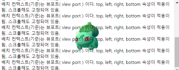
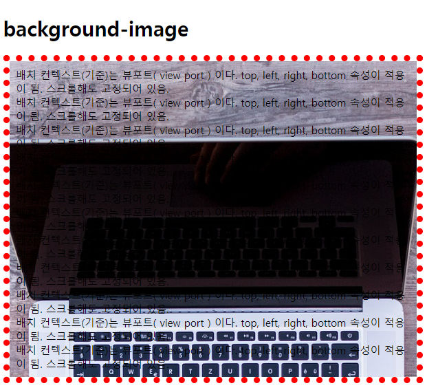
7) 이미지를 border 및 padding 및 content 영역까지 설정
- background-clip 속성
- 문법:
background-clip: border-box | padding-box | content-box;
border-box: 기본, 배경이미지가 border(테두리)까지 차지함.
z축 순서상 배경이미지와 border 가 겹쳐서 보임.
padding-box: 배경이미지가 padding(안쪽여백)까지 차지함.
border 까지 차지안함.
content-box: 배경이미지가 content 까지 차지함.
<!DOCTYPE html>
<html lang="en">

<head>
    <title>background06_clip</title>
    <meta charset="UTF-8">
    <meta name="viewport" content="width=device-width, initial-scale=1.0">
    <style>
        div {
            background-image: url("images/plans-background.jpg");
            background-repeat: no-repeat;
            background-size: auto;
            background-position: top;

            /* background-clip: border-box | padding-box | content-box; */
            padding: 10px;
            /* background-clip: border-box; */
            /* background-clip: padding-box; */
            background-clip: content-box;
        }
    </style>
</head>

<body>
    <h1>background-image</h1>
    <div style="border: 10px dotted red;">
        배치 컨텍스트(기준)는 뷰포트( view port ) 이다.
        top, left, right, bottom 속성이 적용이 됨.
        스크롤해도 고정되어 있음.<br>
        배치 컨텍스트(기준)는 뷰포트( view port ) 이다.
        top, left, right, bottom 속성이 적용이 됨.
        스크롤해도 고정되어 있음.<br>
		.....
    </div>
</body>

</html>
'[study]이론정리 > HTML & CSS & JavaScript' 카테고리의 다른 글
| CSS 4일차 - 3일차 정리 (0) | 2024.04.25 |
|---|---|
| CSS 3일차 - 크기단위 ( units ) (0) | 2024.04.24 |
| CSS 3일차 - 요소배치(position) (0) | 2024.04.24 |
| CSS 3일차 - 2일차 정리 및 수정 (0) | 2024.04.24 |
| CSS 2일차 - Box Model, box-sizing, margin, padding, border (1) | 2024.04.23 |

