7. Box 모델
1) 개요
- CSS 상에서 모든 요소( tag )는 box 로 인식한다.
2) 구성요소
<!DOCTYPE html>
<html lang="en">

<head>
    <title>Box Model 기본</title>
    <style>
        * {
            margin: 0px;
        }
    </style>
</head>

<body>
    <p>Hello</p>
    <div>world</div>
    <p>Hello2</p>
    <span>Hello3</span>
</body>

</html>
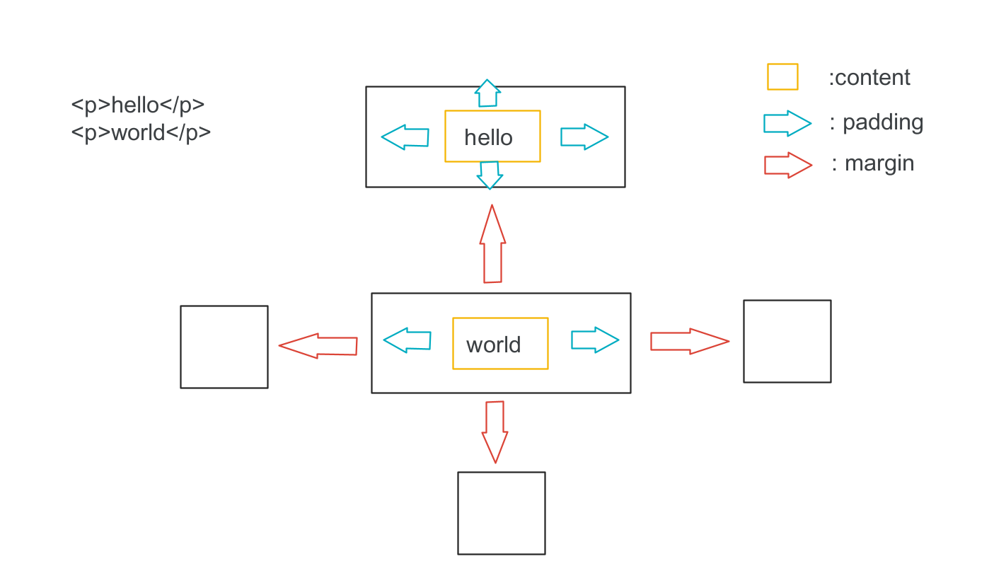
가. content
- 요소의 실제 내용 ( 텍스트, 이미지 등.. )
- 안쪽 여백
다. border
- padding 과 content 를 둘러싼 영역
라. margin
- 바깥쪽 여백
==> 크롬 개발자도구에서 확인이 가능하다.
==> 웹브라우저에서는 300px 너비를 맞췄는데
실제 Box Model 에서는 284px 로 보인다.
==> 블럭(block) 레벨은 실제 Box Model 의 너비가
숫자로 보이고 인라인(inline) 레벨에서는
실제 Box Model 의 너비는 auto로 지정되어 보인다.
이유는 블럭레벨은 기본적으로 전체너비를 확보하고
인라인 레벨은 content 만큼만 너비를 확보하기 때문이다.
따라서, 블럭레벨은 전체너비를 사용하기 때문에
다음 요소는 new line 에 랜더링 되고 width 와 height 지정해서
값이 변경이 가능함.
인라인 레벨은 필요한 만큼만 너비를 확보하기 때문에
new line 없이 한줄에 랜더링이 되고 width 와 height 지정해도
적용이 안됨.
3) width 와 height
가. 개념
- Box Model 에서의 content 의 너비(width)와 높이(height)를 의미한다.
- 지정하지 않으면 실제 요소크기로 설정된다.
( 블럭레벨은 전체너비 사용, 인라인레벨은 필요한 만큼만 차지함 )
- 지정하면 블럭레벨은 적용이 되지만 인라인레벨은 적용이 안됨.
나. width
- 인라인 레벨은 적용이 안됨.
- 블럭레벨 요소는 기본적으로 전체 너비를 사용한다.
- 문법:
width:px | %
px: 절대값
%: 상대값, 기준은 가장 가까운 부모요소이다.
하지만 position ( static, fixed, relative, absolute ) 에 따라서 기준이 달라질 수 있음.
만약에 부모가 100px 이고 자식이 50% 라면
실제 자식 너비는 50px 이다.
다. height
- 인라인 레벨은 적용안됨
- 블럭레벨 요소는 기본적으로 필요한 높이를 사용한다.
- 문법:
height:px | %
px: 절대값
%: 상대값, 기준은 가장 가까운 부모요소이다.
만약에 부모가 100px 이고 자식이 50% 라면
실제 자식 높이는 50px 이다.
** width 와 height 사용시 고려해야될 사항 **
지정된 width 와 height 가 content 의 width 와 height 가 아니다.
기본적으로 항상 지정된 값보다 크게 보임.
이유는 padding 과 border 관여가 된다.
margin 은 제외됨. ( margin 는 여백상쇄가 발생되기 때문에 width 와 height 사용시 고려대상이 아님 )
<!DOCTYPE html>
<html lang="en">

<head>
    <title>Box Model2 - width 와 height</title>
    <style>
        /* 1. 기본적인 블럭레벨의 width 와 height 실펴보기 */
        /*
        너비는 전체너비를 자치하고
        높이는 컨텐츠만큼의 높이를 차지함.
         */
        #a {
            background-color: red;
        }

        /*
        2. 블럭레벨이기 때문에 width 와 height를 지정할 수 있고
           적용이 됨.
        */
        #b {
            background-color: aqua;
            width: 400px;
            height: 300px;
        }

        /*
        3. 인라인 레벨이기 때문에 width 와 height 를 지어해도
           적용이 안됨.
           - 자신만의 컨텐츠영역만 확보하기 때문.
        */
        #c {
            background-color: yellow;
            width: 400px;
            height: 300px;
        }
    </style>
</head>

<body>
    <!-- block 레벨 -->
    <div id="a">A</div>
    <div id="b">B</div>

    <!-- inline 레벨 -->
    <span id="c">C</span>
</body>

</html>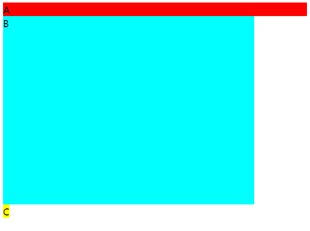
<!DOCTYPE html>
<html lang="en">

<head>
    <title>Box Model2 - width 와 height 퍼센트 단위</title>
    <style>
        /* 1. 부모 컨테이너 크기 미설정한 경우 */
        /* x(부모) 의 100% 만큼만 높이를 차지한다. */
        #y {
            width: 200px;
            height: 100%;
            background-color: yellow;
        }

        /* 2. 부모컨테이너 크기 설정한 경우 */
        #x2 {
            height: 500px;
            background-color: beige;
        }

        #y2 {
            /* 가장 가까운 부모인 #x2 의 500px 에 대한 50%(250px) 가 적용됨 */
            width: 200px;
            height: 50%;
            background-color: aqua;
        }
    </style>
</head>

<body>
    <h1>1. 부모 컨테이너 크기 미설정한 경우</h1>
    <div id="x">
        <div id="y">
            AAA
        </div>
    </div>

    <h1>2. 부모 컨데이너 크기 설정한 경우</h1>
    <div id="x2">
        <div id="y2">
            AAA
        </div>
    </div>
</body>

</html>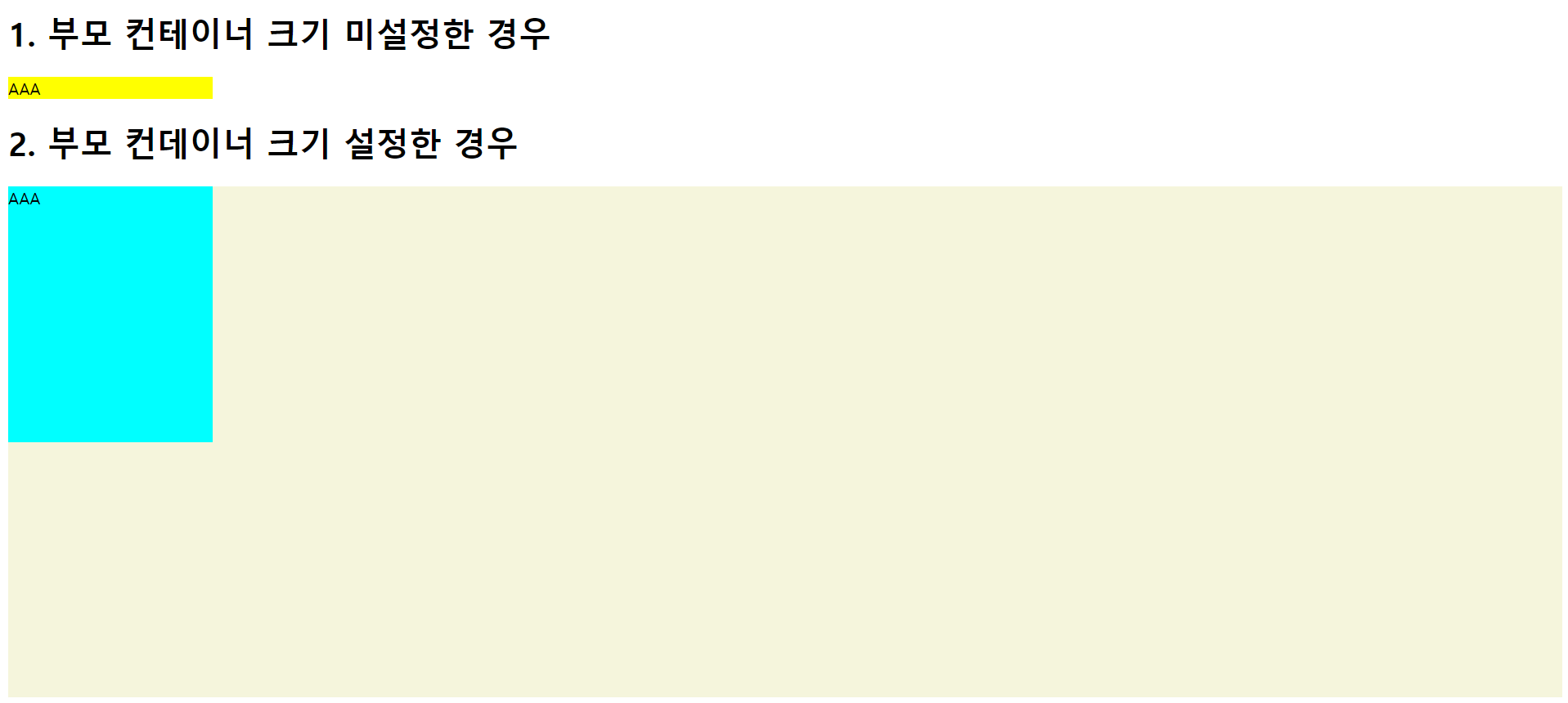
8. box-sizing 속성
1) 개념: 요소의 너비와 높이를 계산하는 방식이다.
2) 종류
가. content-box 개념
- 기본
- 지정된 width 와 height 값이 아닌
padding + border 값이 추가되어 최종적으로 box의 보여지는
크기가 정해지는 방식이다.
따라서 실제 너비와 높이보다 더 커지는 상황이 발생될 수 있음.
최종 width = 지정 width 값 + ( 2*padding ) + ( 2*border )
최종 height = 지정 height 값 + ( 2*padding ) + ( 2*border )
나. border-box 개념
- content-box 와 다르게 자동으로 padding + border 값이 포함되어
width 와 height 값이 정해지는 방식이다.
최종 width = 지정 width 값
최종 height = 지정 height
- 실제로는 다음과 같이 설정하고 사용한다.
ex)
* {
box-sizing: border-box;
}
<!DOCTYPE html>
<html lang="en">

<head>
    <title>Box Model2 - width 와 height3 box-sizing_content-box</title>
    <style>
        #a {
            width: 160px;
            height: 80px;
            background-color: yellow;
            /* 기본이 content-box */
            box-sizing: content-box;
        }

        #b {
            width: 160px;
            height: 80px;
            background-color: aqua;
            border: 8px solid red;
            /* 기본이 content-box */
            box-sizing: content-box;
            /*
            최종 width = 지정 width 값 + ( 2*padding ) + ( 2*border )
                       = 160px + (2*8px) = 176px
            */
        }

        #c {
            width: 160px;
            height: 80px;
            background-color: beige;
            border: 8px solid black;
            padding: 20px;
            /* 기본이 content-box */
            box-sizing: content-box;
            /*
            최종 width = 지정 width 값 + ( 2*padding ) + ( 2*border )
                       = 160px + (2*8px) + (2*20px) = 216px
            */
        }

        #d {
            width: 160px;
            height: 80px;
            background-color: green;
            border: 8px solid skyblue;
            padding: 20px;
            /* margin: top right bottom left */
            margin: 0px 200px 0px 0px;
            /* 기본이 content-box */
            box-sizing: content-box;
            /*
            최종 width = 지정 width 값 + ( 2*padding ) + ( 2*border )
                       = 160px + (2*8px) + (2*20px) = 216px
            - margin 은 최종 width 에 영향을 주지 않는다.
            */
        }
    </style>
</head>

<body>
    <div id="a">hello1</div>
    <div id="b">hello2</div>
    <div id="c">hello3</div>
    <div id="d">hello4</div>
</body>

</html>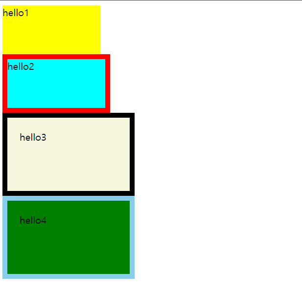
<!DOCTYPE html>
<html lang="en">

<head>
    <title>Box Model2 - width 와 height3 box-sizing_border-box</title>
    <style>
        #a {
            width: 160px;
            height: 80px;
            background-color: yellow;
            box-sizing: border-box;
        }

        #b {
            width: 160px;
            height: 80px;
            background-color: aqua;
            border: 8px solid red;
            box-sizing: border-box;
        }

        #c {
            width: 160px;
            height: 80px;
            background-color: beige;
            border: 8px solid black;
            padding: 20px;
            box-sizing: border-box;
        }

        #d {
            width: 160px;
            height: 80px;
            background-color: green;
            border: 8px solid skyblue;
            padding: 20px;
            /* margin: top right bottom left */
            margin: 0px 200px 0px 0px;
            box-sizing: border-box;
        }
    </style>
</head>

<body>
    <div id="a">hello1</div>
    <div id="b">hello2</div>
    <div id="c">hello3</div>
    <div id="d">hello4</div>
</body>

</html>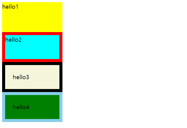
9. margin
1) 기능
- Box 와 Box 사이의 여백( 바깥쪽 여백 ) 제어.
- px 와 % 지정 가능
2) 문법1
- 개별적으로 요소 지정
margin-top: 10px;
margin-right: 10px;
margin-bottom: 10px;
margin-left: 10px;
2) 문법2 - 축약표현
가. margin: top right bottom left
margin: 10px 10px 10px 10px;
나. margin: top right | left bottom
margin: 10px 10px 10px;
다. margin: top | bottom right | left
margin: 10px 10px;
라 margin: top | bottom | right | left
margin: 10px;
==> 축약된 표현식은 개발자도구에서 어떻게
축약되었는지를 보여준다.
==> body 태그가 기본적으로 margin: 8px; 가진다.
이 값이 브라우저의 기본값이다.
body {
display: block;
margin: 8px;
}
일반적으로 이 값을 제거하고 요소가 페이지의 바로 배치되도록 수정해서 사용한다.
* {
margin: 0px;
}
==> margin 의 여백 상쇄
인접한 Box 의 margin은 서로 겹쳐질수 있는데
하나로 합쳐져서 margin 만들어지는 것이 아니고 큰 크기의 여백으로 적용된다.
이유는 요소간 거리가 너무 멀어지는 것을 방지한다.
만약에 필요하면 명시적으로 margin-top | margin-bottom 을 지정해야된다.
==> margin:auto; 수평정렬 가능
반드시 block 레벨이면서 width 값을 가져야 된다.
inline 레벨에서는 동작안됨.
<!DOCTYPE html>
<html lang="en">

<head>
    <title>Box Model3 - margin1_기본</title>
    <style>
        div {
            height: 100px;
            width: 100px;
            background-color: skyblue;
        }

        /* 기본 */
        #a {
            margin-top: 10px;
            margin-right: 10px;
            margin-bottom: 10px;
            margin-left: 10px;
        }

        /* 축약(1) margin: top right bottom left */
        #b {
            margin: 10px 10px 10px 10px;
        }

        /* 축약(2)  margin: top right|left bottom */
        /* right 와 left 가 똑같을때 */
        #c {
            margin: 10px 10px 10px;
        }

        /* 축약(3) margin: top|bottom right|left */
        /* top-bottom 과 left-right 가 똑같을때 */
        #d {
            margin: 10px 10px;
        }

        /* 축약(4) margin: top|bottom|right|left */
        /* top-bottom-left-right 가 동일할때 */
        #e {
            margin: 10px;
        }
    </style>
</head>

<body>
    <div id="a">hello1</div>
    <div id="b">hello2</div>
    <div id="c">hello3</div>
    <div id="d">hello4</div>
    <div id="e">hello5</div>
</body>

</html>
<!DOCTYPE html>
<html lang="en">

<head>
    <title>Box Model3 - margin2_여백상쇄</title>
    <style>
        div {
            height: 100px;
            width: 100px;
            background-color: skyblue;
        }

        #a {
            margin: 20px 0px;
        }


        #b {
            margin: 50px 0px;
        }
    </style>
</head>

<body>
    <div id="a">hello1</div>
    <div id="b">hello2</div>
</body>

</html>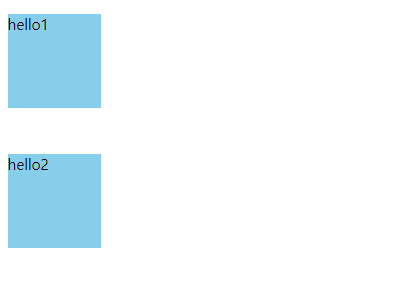
<!DOCTYPE html>
<html lang="en">

<head>
    <title>Box Model3 - margin3_수평정렬</title>
    <style>
        /* margin:auto; - 블럭레벨이면서 width 값을 가지고있어야함. */
        #a {
            width: 200px;
            margin: auto;
            background-color: skyblue;
        }

        #b {
            margin: auto;
            background-color: violet;
        }
    </style>
</head>

<body>
    <!-- 블럭레벨 -->
    <div id="a">hello1</div>
    <!-- 인라인레벨 -->
    <span id="b">hello2</span>
</body>

</html>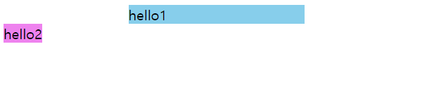
10. padding
1) 기능
- content 와 border 사이의 여백( 안쪽 여백 ) 제어.
- px 와 % 지정 가능
2) 문법1
- 개별적으로 요소 지정
padding-top: 10px;
padding-right: 10px;
padding-bottom: 10px;
padding-left: 10px;
2) 문법2 - 축약표현
가. padding: top right bottom left
padding: 10px 10px 10px 10px;
나. padding: top right | left bottom
padding: 10px 10px 10px;
다. padding: top | bottom right | left
padding: 10px 10px;
라 padding: top | bottom | right | left
padding: 10px;
<!DOCTYPE html>
<html lang="en">

<head>
    <title>Box Model4 - padding1_기본</title>
    <style>
        div {
            height: 100px;
            width: 100px;
            margin: 20px;
            border: 1px solid red;
            background-color: antiquewhite;
        }

        /* 기본 */
        #a {
            padding-top: 30px;
            padding-right: 30px;
            padding-bottom: 30px;
            padding-left: 30px;
        }

        /* 축약(1) padding: top right bottom left */
        #b {
            padding: 30px 30px 30px 30px;
        }

        /* 축약(2)  padding: top right|left bottom */
        /* right 와 left 가 똑같을때 */
        #c {
            padding: 30px 30px 30px;
        }

        /* 축약(3) padding: top|bottom right|left */
        /* top-bottom 과 left-right 가 똑같을때 */
        #d {
            padding: 30px 30px;
        }

        /* 축약(4) padding: top|bottom|right|left */
        /* top-bottom-left-right 가 동일할때 */
        #e {
            padding: 30px;
        }
    </style>
</head>

<body>
    <div id="a">hello1</div>
    <div id="b">hello2</div>
    <div id="c">hello3</div>
    <div id="d">hello4</div>
    <div id="e">hello5</div>
</body>

</html>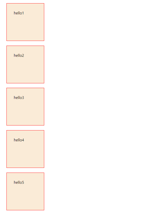
11. border
1) 개요
- 테두리
- margin 과 padding 사이에 둘러싸인 요소.
- 3가지 속성을 이용해서 스타일링 가능.
가. width: border 의 두께
나. style: border 의 스타일( 실선, 점선,... )
다. color: border 의 색상
2) 표현식 1
가. width
boder-top-width: 5px;
boder-right-width: 5px;
boder-bottom-width: 5px;
boder-left-width: 5px;
나. style
boder-top-style: solid | dotted | dashed;
boder-right-style: solid | dotted | dashed;
boder-bottom-style: solid | dotted | dashed;
boder-left-style: solid | dotted | dashed;
다. color
border-color: red;
2) 표현식 2 - 축약
가. width
border-width: top right bottom left;
border-width: top right | left bottom;
border-width: top | bottom right | left;
border-width: top | right | bottom | left;
나. style ( solid, dotted, dashed )
border-style: top right bottom left;
border-style: top right | left bottom;
border-style: top | bottom right | left;
border-style: top | right | bottom | left;
2) 표현식3-축약 ( *** )
border: width style color;
ex)
border: 3px solid red;
3) border-radius 속성
- 박스 모서리를 둥글게 설정할 때 사용
- 값이 클수록 많이 둥그러짐.
border-radius: 20px;
border-radius: 50% // 원
<!DOCTYPE html>
<html lang="en">

<head>
    <title>Box Model5 - border-radius</title>
    <style>
        div {
            height: 100px;
            width: 100px;
            margin: 20px;
            border: 1px solid red;
            background-color: beige;
        }

        /* 기본 */
        #a {
            padding-top: 30px;
            padding-right: 30px;
            padding-bottom: 30px;
            padding-left: 30px;
            border-radius: 20px;
        }

        /* 축약(1) padding: top right bottom left */
        #b {
            padding: 30px 30px 30px 30px;
            border-radius: 50px;
        }

        /* 축약(2)  padding: top right|left bottom */
        /* right 와 left 가 똑같을때 */
        #c {
            padding: 30px 30px 30px;
            border-radius: 50%;
        }

        /* 축약(3) padding: top|bottom right|left */
        /* top-bottom 과 left-right 가 똑같을때 */
        #d {
            padding: 30px 30px;
        }

        /* 축약(4) padding: top|bottom|right|left */
        /* top-bottom-left-right 가 동일할때 */
        #e {
            padding: 30px;
        }
    </style>
</head>

<body>
    <div id="a">hello1</div>
    <div id="b">hello2</div>
    <div id="c">hello3</div>
    <div id="d">hello4</div>
    <div id="e">hello5</div>
</body>

</html>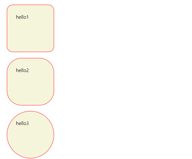
'[study]이론정리 > HTML & CSS & JavaScript' 카테고리의 다른 글
| CSS 3일차 - 요소배치(position) (0) | 2024.04.24 |
|---|---|
| CSS 3일차 - 2일차 정리 및 수정 (0) | 2024.04.24 |
| CSS 2일차 - 선택자(2), BEM, 의사클래스, 의사요소 (0) | 2024.04.23 |
| CSS 1일차 - 선택자 (0) | 2024.04.22 |
| CSS 1일차 - 적용방법3가지, 캐스캐이딩 & 명시도 (0) | 2024.04.22 |


