21. FlexBox
1) 개요
전통적으로 레이아웃 처리할 때 사용했던 방식은 position 과 float 을 사용하는 방식임.
FlexBox 문법을 적용하면 매우 쉽게 레이아웃 및 수직정렬, 요소순서(ordering), 동적 사이징
처리가 가능함.
2) 2가지 구성요소
- 반드시 부모/자식관계가 성립되어야 한다.( 자손은 적용안됨 )
- 중첩가능
- 1자원(행(기본)/열)으로 배치됨.
( 전형적인 normal flow 를 따르지 않음 )
- 부모는 display:flex 로 지정
( 실행결과: - 모든 div item 들이 가로(행) 배치됨.
- 명시적으로 지정된 height 제외한 나머지는 가장 큰 height 값이 적용됨.
- 브라우저 화면을 줄이면 일정범위까지만 줄어듬 )
- 부모는 display:inline-flex 로 지정
( 실행결과: - 모든 div item 들이 가로(행) 배치됨.
- 명시적으로 지정된 height 제외한 나머지는 가장 큰 height 값이 적용됨.
- 브라우저 화면을 줄여도 줄어들지 않음
이유는 inline 이기 때문에 자체적인 크기를 고수한다. )
<!DOCTYPE html>
<html>

<head>
    <meta charset="UTF-8">
    <title>flex 실습</title>
    <style type="text/css">
        * {
            box-sizing: border-box;
            font-size: 1.5rem;
        }

        html {
            background: #b3b3b3;
            padding: 5px;
        }

        body {
            background: #b3b3b3;
            padding: 5px;
            margin: 0;
        }

        .flex-container {
            background: white;
            padding: 10px;
            border: 5px solid black;

            /* display: flex; */
            display: inline-flex;
        }

        .item-1 {
            background: #ff7300;
            color: white;
            padding: 10px;
            border: 5px solid black;
            margin: 10px;
        }

        .item-2 {
            background: #ff9640;
            color: white;
            padding: 10px;
            border: 5px solid black;
            margin: 10px;
            width: 250px;
            font-size: 1.8rem;

        }

        .item-3 {
            background: #ff9640;
            color: white;
            padding: 10px;
            border: 5px solid black;
            margin: 10px;
            height: 250px;
        }

        .item-4 {
            background: #f5c096;
            color: white;
            padding: 10px;
            border: 5px solid black;
            margin: 10px;
            width: 300px;
            height: 300px;
        }

        .item-5 {
            background: #d3c0b1;
            color: white;
            padding: 10px;
            border: 5px solid black;
            margin: 10px;
            width: 350px;
        }

        .item-6 {
            background: #d3c0b1;
            color: white;
            padding: 10px;
            border: 5px solid black;
            margin: 10px;
            width: 350px;
        }
    </style>
</head>

<body>
    <div class="flex-container">
        <div class="item-1">div</div>
        <div class="item-2">w=250px</div>
        <div class="item-3">h=250px</div>
        <div class="item-4">w/h=300px</div>
        <div class="item-5">w=350px</div>
        <div class="item-6">w=350px</div>
    </div>
</body>

</html>
가. flex container
- display: flex;
- container 에서만 사용가능한 속성들
나. flex item
- item 에서만 사용가능한 속성들
ex)
.container {
display: flex;
}
<div class="container"> // 부모
<div>item</div> // 자식
<div>item</div>
<div>item
<div>item2</div> // 자손 ( flex item 아님. ) 은 제외
</div>
<div class = "container2"> // 중첩가능 ( 자식이 또 다른 container 가 될수 있음 )
<div>item</div>
</div>
</div>
3) Container 에서 사용가능한 속성
* 2가지 축
주축: item 이 배치되는 방향 의미. 기본은 row
교차축: 주축의 수직인 방향의미.
가. flex-direction 속성
- 주축의 방향 결정
- 속성값:
row - 기본값, 왼쪽 -> 오른쪽
row-reverse - 오른쪽 -> 왼쪽
column - 위 -> 아래
column-reverse - 아래 -> 위
<!DOCTYPE html>
<html>

<head>
    <meta charset="UTF-8">
    <title>flex direction</title>
    <style type="text/css">
        * {
            box-sizing: border-box;
            font-size: 1.5rem;
        }

        html {
            background: #b3b3b3;
            padding: 5px;
        }

        body {
            background: #b3b3b3;
            padding: 5px;
            margin: 0;
        }

        .flex-container {
            background: white;
            padding: 10px;
            border: 5px solid black;

            display: flex;
            /* row: 왼->오 */
            flex-direction: row;

            /* row-reverse: 오->왼 */
            /* flex-direction: row-reverse; */

            /* column: 위 -> 아래 */
            /* flex-direction: column; */
            /* column-reverse: 아래 -> 위 */
            /* flex-direction: column-reverse; */
        }

        .item-1 {
            background: #ff7300;
            color: white;
            padding: 10px;
            border: 5px solid black;
            margin: 10px;
        }

        .item-2 {
            background: #ff9640;
            color: white;
            padding: 10px;
            border: 5px solid black;
            margin: 10px;
            width: 250px;
            font-size: 1.8rem;

        }

        .item-3 {
            background: #ff9640;
            color: white;
            padding: 10px;
            border: 5px solid black;
            margin: 10px;
            height: 250px;
        }

        .item-4 {
            background: #f5c096;
            color: white;
            padding: 10px;
            border: 5px solid black;
            margin: 10px;
            width: 300px;
            height: 300px;
        }

        .item-5 {
            background: #d3c0b1;
            color: white;
            padding: 10px;
            border: 5px solid black;
            margin: 10px;
            width: 350px;
        }

        .item-6 {
            background: #d3c0b1;
            color: white;
            padding: 10px;
            border: 5px solid black;
            margin: 10px;
            width: 350px;
        }
    </style>
</head>

<body>
    <div class="flex-container">
        <div class="item-1">div</div>
        <div class="item-2">w=250px</div>
        <div class="item-3">h=250px</div>
        <div class="item-4">w/h=300px</div>
        <div class="item-5">w=350px</div>
        <div class="item-6">w=350px</div>
    </div>
</body>

</html>
나. flex-wrap
- 화면크기를 줄일때 일정범위까지는 축소되고 item 이 안보이게 된다.
축소되지않고 새로운줄에 랜더링이 가능하도록 제어.
- 속성값:
nowrap - 기본
wrap - 상단기준 ( 아래쪽에 wrap 됨 )
wrap-reverse - 하단기준 ( 위쪽에 wrap 됨 )
- 특징
wrap 되면 기존의 최대 height 가 아닌 컨텐츠의 height 만 차지함.
계속 화면을 줄이면 하나의 열로 표시됨.
<!DOCTYPE html>
<html>

<head>
    <meta charset="UTF-8">
    <title>flex wrap</title>
    <style type="text/css">
        * {
            box-sizing: border-box;
            font-size: 1.5rem;
        }

        html {
            background: #b3b3b3;
            padding: 5px;
        }

        body {
            background: #b3b3b3;
            padding: 5px;
            margin: 0;
        }

        .flex-container {
            background: white;
            padding: 10px;
            border: 5px solid black;

            display: flex;

            /* 기본: nowrap */
            /* flex-wrap: nowrap; */

            /* wrap: 상->하 */
            flex-wrap: wrap;

            /* wrap-reverse: 하->상 */
            /* flex-wrap: wrap-reverse; */
        }

        .item-1 {
            background: #ff7300;
            color: white;
            padding: 10px;
            border: 5px solid black;
            margin: 10px;
        }

        .item-2 {
            background: #ff9640;
            color: white;
            padding: 10px;
            border: 5px solid black;
            margin: 10px;
            width: 250px;
            font-size: 1.8rem;

        }

        .item-3 {
            background: #ff9640;
            color: white;
            padding: 10px;
            border: 5px solid black;
            margin: 10px;
            height: 250px;
        }

        .item-4 {
            background: #f5c096;
            color: white;
            padding: 10px;
            border: 5px solid black;
            margin: 10px;
            width: 300px;
            height: 300px;
        }

        .item-5 {
            background: #d3c0b1;
            color: white;
            padding: 10px;
            border: 5px solid black;
            margin: 10px;
            width: 350px;
        }

        .item-6 {
            background: #d3c0b1;
            color: white;
            padding: 10px;
            border: 5px solid black;
            margin: 10px;
            width: 350px;
        }
    </style>
</head>

<body>
    <div class="flex-container">
        <div class="item-1">div</div>
        <div class="item-2">w=250px</div>
        <div class="item-3">h=250px</div>
        <div class="item-4">w/h=300px</div>
        <div class="item-5">w=350px</div>
        <div class="item-6">w=350px</div>
    </div>
</body>

</html>
다. flex-flow
flex-direction 와 flex-wrap 의 축약표현식
- 문법:
flex-flow: direction wrap
ex) flex-flow: row wrap;
라. align-items
- 교차축에 대한 정렬
- 속성값
flex-start
flex-end
center
baseline : item 의 실제 컨텐츠의 기준선에 맞춰정렬됨.
stretch: 기본값. 기본적으로 item 을 늘려서 container 를 꽉채움.
<!DOCTYPE html>
<html>

<head>
    <meta charset="UTF-8">
    <title>교차축에 대한 정렬: align-items</title>
    <style type="text/css">
        * {
            box-sizing: border-box;
            font-size: 1.5rem;
        }

        html {
            background: #b3b3b3;
            padding: 5px;
        }

        body {
            background: #b3b3b3;
            padding: 5px;
            margin: 0;
        }

        .flex-container {
            background: white;
            padding: 10px;
            border: 5px solid black;

            display: flex;
            flex-direction: row;
            /* 주축은 x 축 교차축은 y 축 */

            /* 교차축에 대한 정렬 */
            /* 기본: stretch; 기본적으로 item 을 늘려서 container 를 꽉채움. */
            /* align-items: stretch; */

            align-items: flex-start;
            /* align-items: flex-end; */
            /* align-items: center; */
            /* align-items: baseline; */

        }

        .item-1 {
            background: #ff7300;
            color: white;
            padding: 10px;
            border: 5px solid black;
            margin: 10px;
        }

        .item-2 {
            background: #ff9640;
            color: white;
            padding: 10px;
            border: 5px solid black;
            margin: 10px;
            width: 250px;
            font-size: 1.8rem;

        }

        .item-3 {
            background: #ff9640;
            color: white;
            padding: 10px;
            border: 5px solid black;
            margin: 10px;
            height: 250px;
        }

        .item-4 {
            background: #f5c096;
            color: white;
            padding: 10px;
            border: 5px solid black;
            margin: 10px;
            width: 300px;
            height: 300px;
        }

        .item-5 {
            background: #d3c0b1;
            color: white;
            padding: 10px;
            border: 5px solid black;
            margin: 10px;
            width: 350px;
        }

        .item-6 {
            background: #d3c0b1;
            color: white;
            padding: 10px;
            border: 5px solid black;
            margin: 10px;
            width: 350px;
        }
    </style>
</head>

<body>
    <div class="flex-container">
        <div class="item-1">div</div>
        <div class="item-2">w=250px</div>
        <div class="item-3">h=250px</div>
        <div class="item-4">w/h=300px</div>
        <div class="item-5">w=350px</div>
        <div class="item-6">w=350px</div>
    </div>
</body>

</html>

마. justify-content
- 주축에 대한 정렬
- 속성값
flext-start
flex-end
center
space-around
space-between
space-evenly
<!DOCTYPE html>
<html>

<head>
    <meta charset="UTF-8">
    <title>주축에 대한 정렬: justify-content</title>
    <style type="text/css">
        * {
            box-sizing: border-box;
            font-size: 1.5rem;
        }

        html {
            background: #b3b3b3;
            padding: 5px;
        }

        body {
            background: #b3b3b3;
            padding: 5px;
            margin: 0;
        }

        .flex-container {
            background: white;
            padding: 10px;
            border: 5px solid black;

            display: flex;
            flex-direction: row;
            /* 주축은 x 축 교차축은 y 축 */

            /* 주축에 대한 정렬 */
            /* justify-content: flex-start; */
            /* justify-content: flex-end; */
            /* justify-content: center; */
            /* justify-content: space-around; */
            /* justify-content: space-between; */
            justify-content: space-evenly;
        }

        .item-1 {
            background: #ff7300;
            color: white;
            padding: 10px;
            border: 5px solid black;
            margin: 10px;
        }

        .item-2 {
            background: #ff9640;
            color: white;
            padding: 10px;
            border: 5px solid black;
            margin: 10px;
            width: 250px;
            font-size: 1.8rem;

        }

        .item-3 {
            background: #ff9640;
            color: white;
            padding: 10px;
            border: 5px solid black;
            margin: 10px;
            height: 250px;
        }
    </style>
</head>

<body>
    <div class="flex-container">
        <div class="item-1">div</div>
        <div class="item-2">w=250px</div>
        <div class="item-3">h=250px</div>
    </div>
</body>

</html>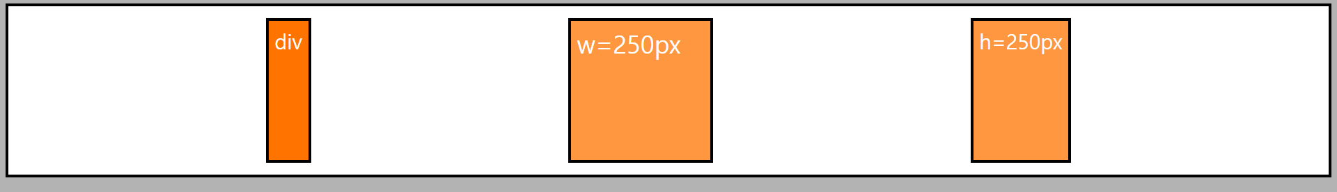
바. align-content
- align-items + justify-content 합성 기능.
- 반드시 wrap 된 상태에서만 적용가능. ( nowrap 일시 적용안됨 )
- 속성값
flex-start
flex-end
center
baseline: item 의 실제 컨텐츠의 기준에 맞춰 정렬됨.
stretch
space-around
space-between
space-evenly
<!DOCTYPE html>
<html>

<head>
    <meta charset="UTF-8">
    <title>주축 및 교차축에 대한 정렬: align-content</title>
    <style type="text/css">
        * {
            box-sizing: border-box;
            font-size: 1.5rem;
        }

        html {
            background: #b3b3b3;
            padding: 5px;
        }

        body {
            background: #b3b3b3;
            padding: 5px;
            margin: 0;
        }

        .flex-container {
            background: white;
            padding: 10px;
            border: 5px solid black;

            display: flex;
            flex-direction: row;
            height: 1500px;
            /* 주축은 x 축 교차축은 y 축 */
            /* align-content 는 wrap 한상태에서만 적용가능. */
            flex-wrap: wrap;

            /* align-content: center; */
            /* align-content: flex-start; */
            /* align-content: flex-end; */
            /* align-content: baseline; */
            /* align-content: space-around; */
            /* align-content: space-between; */
            align-content: space-evenly;
        }

        .item-1 {
            background: #ff7300;
            color: white;
            padding: 10px;
            border: 5px solid black;
            margin: 10px;
        }

        .item-2 {
            background: #ff9640;
            color: white;
            padding: 10px;
            border: 5px solid black;
            margin: 10px;
            width: 250px;
            font-size: 1.8rem;

        }

        .item-3 {
            background: #ff9640;
            color: white;
            padding: 10px;
            border: 5px solid black;
            margin: 10px;
            height: 250px;
        }

        .item-4 {
            background: #f5c096;
            color: white;
            padding: 10px;
            border: 5px solid black;
            margin: 10px;
            width: 300px;
            height: 300px;
        }

        .item-5 {
            background: #d3c0b1;
            color: white;
            padding: 10px;
            border: 5px solid black;
            margin: 10px;
            width: 350px;
        }

        .item-6 {
            background: #d3c0b1;
            color: white;
            padding: 10px;
            border: 5px solid black;
            margin: 10px;
            width: 350px;
        }
    </style>
</head>

<body>
    <div class="flex-container">
        <div class="item-1">div</div>
        <div class="item-2">w=250px</div>
        <div class="item-3">h=250px</div>
        <div class="item-4">w/h=300px</div>
        <div class="item-5">w=350px</div>
        <div class="item-6">w=350px</div>
    </div>
</body>

</html>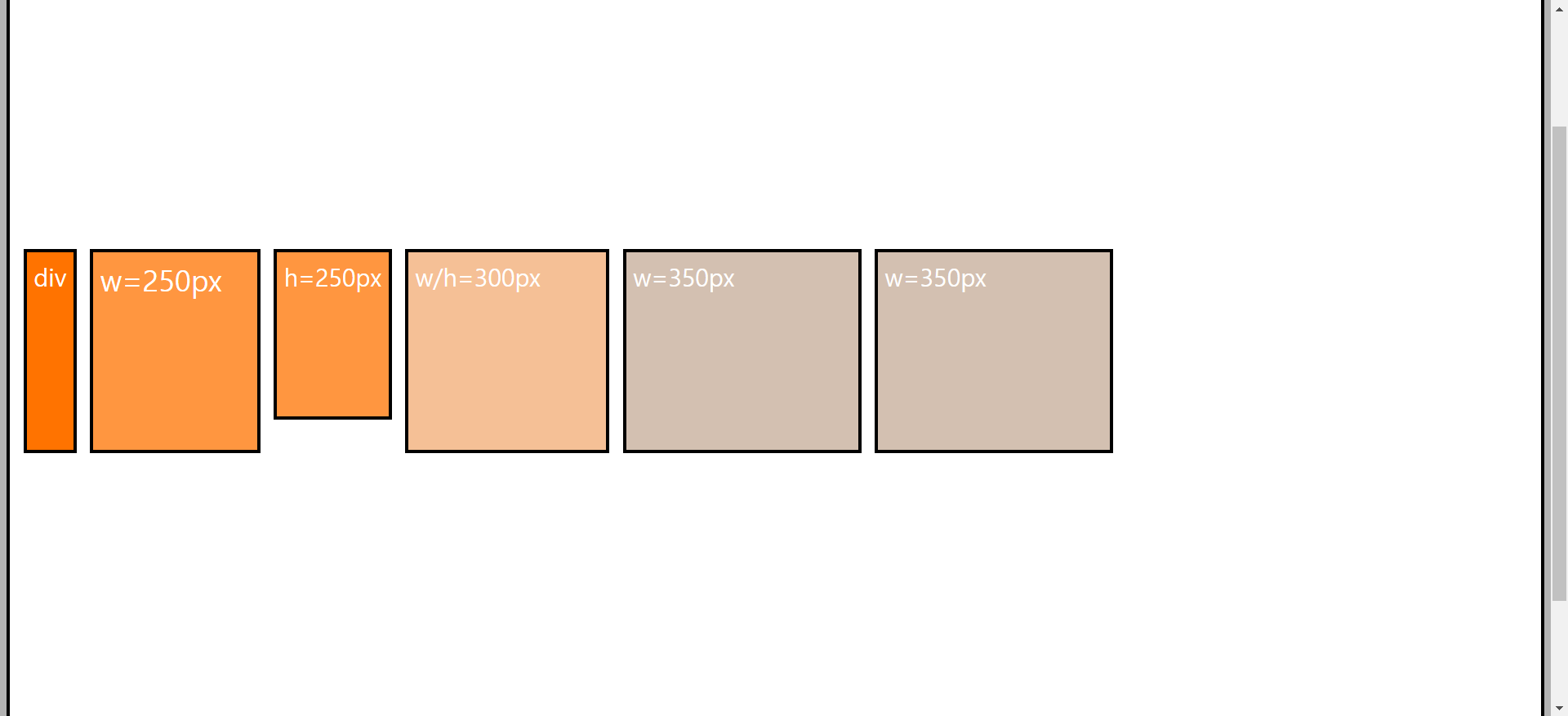
4) item 에서 사용 가능한 속성
가. order 속성
- 기본적으로는 코드에 지정된 순서로 표시된다.
order 를 이용해서 나타내는 순서를 변경할 수 있다.
- order: 0 기본값
-1 0 1
(앞) (기본값) (뒤)
<!DOCTYPE html>
<html>

<head>
    <meta charset="UTF-8">
    <title>item속성1_order</title>
    <style type="text/css">
        * {
            box-sizing: border-box;
            font-size: 1.5rem;
        }

        html {
            background: #b3b3b3;
            padding: 5px;
        }

        body {
            background: #b3b3b3;
            padding: 5px;
            margin: 0;
        }

        .flex-container {
            background: white;
            padding: 10px;
            border: 5px solid black;

            display: flex;
            flex-direction: row;
            /* 주축은 x 축 교차축은 y 축 */
            /* align-content 는 wrap 한상태에서만 적용가능. */
            flex-wrap: wrap;
        }

        .item-1 {
            background: #ff7300;
            color: white;
            padding: 10px;
            border: 5px solid black;
            margin: 10px;

            /* order 양수 -> 기본이 0 이라 뒤에 배치 */
            order: 1;
        }

        .item-2 {
            background: #ff9640;
            color: white;
            padding: 10px;
            border: 5px solid black;
            margin: 10px;
            width: 250px;
            font-size: 1.8rem;

        }

        .item-3 {
            background: #ff9640;
            color: white;
            padding: 10px;
            border: 5px solid black;
            margin: 10px;
            height: 250px;
        }

        .item-4 {
            background: #f5c096;
            color: white;
            padding: 10px;
            border: 5px solid black;
            margin: 10px;
            width: 300px;
            height: 300px;
        }

        .item-5 {
            background: #d3c0b1;
            color: white;
            padding: 10px;
            border: 5px solid black;
            margin: 10px;
            width: 350px;
        }

        .item-6 {
            background: #d3c0b1;
            color: white;
            padding: 10px;
            border: 5px solid black;
            margin: 10px;
            width: 350px;

            /* -1 은 0 앞에있기때문에 제일 앞에 배치된다. */
            order: -1;
        }
    </style>
</head>

<body>
    <div class="flex-container">
        <div class="item-1">div</div>
        <div class="item-2">w=250px</div>
        <div class="item-3">h=250px</div>
        <div class="item-4">w/h=300px</div>
        <div class="item-5">w=350px</div>
        <div class="item-6">w=350px</div>
    </div>
</body>

</html>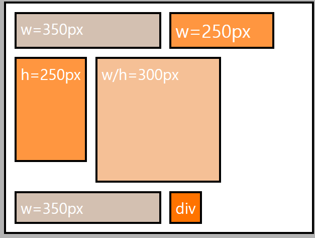
나. align-self 속성
- align-items 는 container 에 지정해서 모든 item 들의 교차축 정렬 제어.
- align-self 는 개별적인 item 의 교차축 정렬
- 속성값:
flex-start
flex-end
center
baseline : item 의 실제 컨텐츠의 기준선에 맞춰정렬됨.
stretch: 기본값. 기본적으로 item 을 늘려서 container 를 꽉채움.
<!DOCTYPE html>
<html>

<head>
    <meta charset="UTF-8">
    <title>item속성2_align-self</title>
    <style type="text/css">
        * {
            box-sizing: border-box;
            font-size: 1.5rem;
        }

        html {
            background: #b3b3b3;
            padding: 5px;
        }

        body {
            background: #b3b3b3;
            padding: 5px;
            margin: 0;
        }

        .flex-container {
            background: white;
            padding: 10px;
            border: 5px solid black;

            display: flex;
            flex-direction: row;
            /* 주축은 x 축 교차축은 y 축 */
            /* align-content 는 wrap 한상태에서만 적용가능. */
            flex-wrap: wrap;
            height: 1500px;

            /*
            모든아이템들은 end 정렬된다. 단, 개별적으로 지정된 item 들은
            지정된 값에따라 재정의가 된다.
            */
            align-items: flex-end;
        }

        .item-1 {
            background: #ff7300;
            color: white;
            padding: 10px;
            border: 5px solid black;
            margin: 10px;
        }

        .item-2 {
            background: #ff9640;
            color: white;
            padding: 10px;
            border: 5px solid black;
            margin: 10px;
            width: 250px;
            font-size: 1.8rem;

        }

        .item-3 {
            background: #ff9640;
            color: white;
            padding: 10px;
            border: 5px solid black;
            margin: 10px;
            height: 250px;
            align-self: center;
        }

        .item-4 {
            background: #f5c096;
            color: white;
            padding: 10px;
            border: 5px solid black;
            margin: 10px;
            width: 300px;
            height: 300px;
        }

        .item-5 {
            background: #d3c0b1;
            color: white;
            padding: 10px;
            border: 5px solid black;
            margin: 10px;
            width: 350px;
        }

        .item-6 {
            background: #d3c0b1;
            color: white;
            padding: 10px;
            border: 5px solid black;
            margin: 10px;
            width: 350px;

            align-self: center;
        }
    </style>
</head>

<body>
    <div class="flex-container">
        <div class="item-1">div</div>
        <div class="item-2">w=250px</div>
        <div class="item-3">h=250px</div>
        <div class="item-4">w/h=300px</div>
        <div class="item-5">w=350px</div>
        <div class="item-6">w=350px</div>
    </div>
</body>

</html>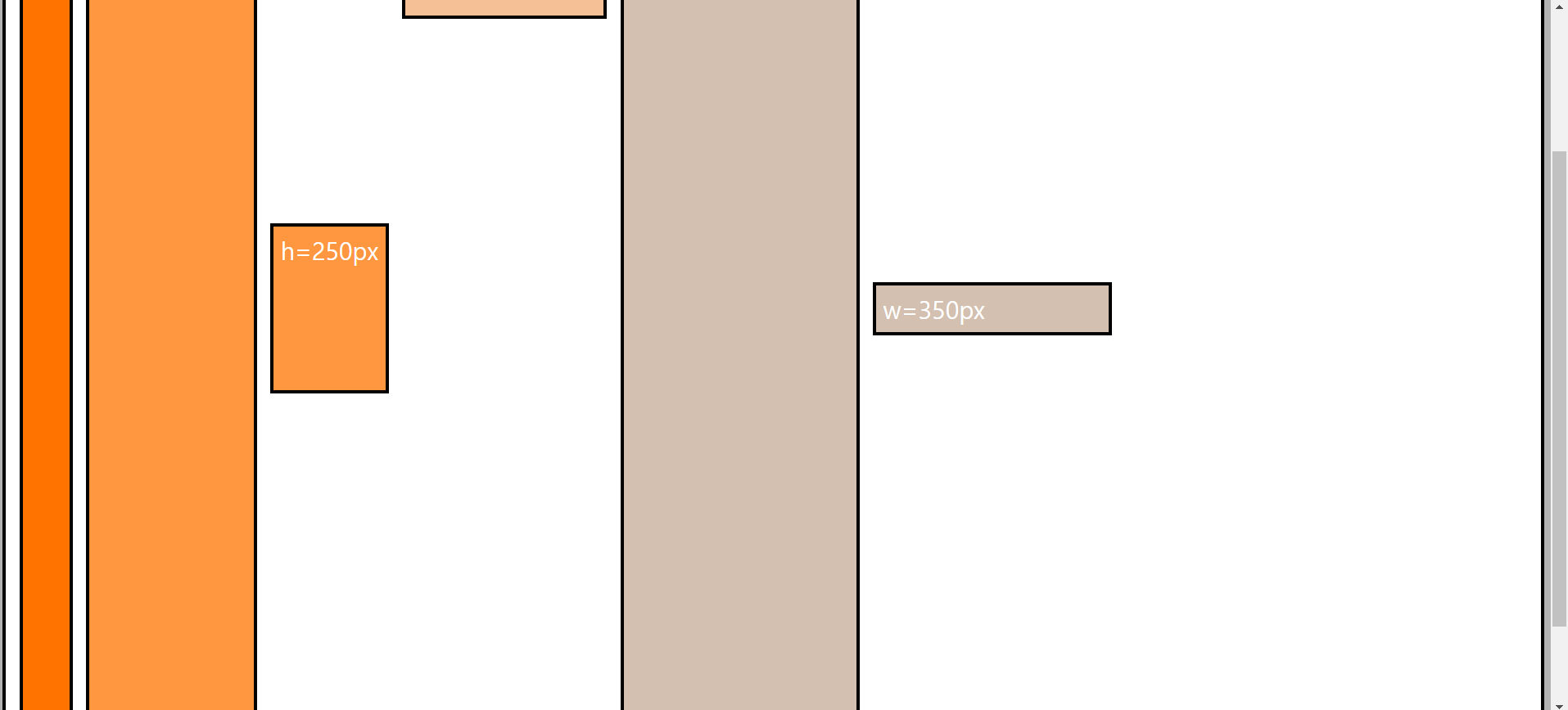
'[study]이론정리 > HTML & CSS & JavaScript' 카테고리의 다른 글
| CSS 5일차 - FlexBox(2) (1) | 2024.04.26 |
|---|---|
| CSS 5일차 - 4일차 정리 (2) | 2024.04.26 |
| CSS 4일차 - 색상, visibility, opacity, font, google font, text (0) | 2024.04.25 |
| CSS 4일차 - 3일차 정리 (0) | 2024.04.25 |
| CSS 3일차 - 크기단위 ( units ) (0) | 2024.04.24 |

